Your mail piece is one of the best ways to communicate with customers, but if you make an error in the design process, you can lose your chance to engage with your consumer and drive their behavior. Rob Hanks, Mailing Support Specialist at Suttle-Straus, recently gave a fantastic presentation to our local Madison, Wisconsin-area Postal Customer Council on the top 10 mistakes mailers make when it comes to mail piece design. If any of these sound familiar, it’s time to re-think your design process. Your customers (and your bottom line) will thank you.
Not Meeting Minimum Mailing Dimensions
The current postal minimum dimensional requirements are as follows:
· Minimum height: 3.5”
· Minimum length: 5.0”
· Minimum thickness: .007”
When mail pieces do not meet these minimum requirements, the piece becomes unmailable by USPS standards. There are several reasons that a piece could fall into this category. Rob gave a couple of examples during his presentation, such as the company that used three by five index cards for their mailing, thinking it would be cheaper (not realizing that the .5” on the minimum height requirement was so important!), or the company that used four by four square cards for their marketing mail. In this latter case, the company knew it would have to pay more due to the size, but the people responsible for the design didn’t realize that the aspect ratio would fail to meet the minimum requirements. Whether they were attempting to save money or not with these decisions, both companies ended up losing money in the end, due to the cost of unmailable pieces and the opportunity cost of lost customer engagement.
Even if your mail piece meets the height and length requirements, thickness and placement of the delivery address can still be an issue. Rob referenced another company that created a letter-size card with the dimensions of four by six (which appear to meet the minimum requirement), but the delivery address was placed parallel to the shortest dimension of the design. As a result, for mailing purposes, the length was only four inches, and the mail piece was not mailable. The mailer stated it was not aware that the placement of the delivery address could negatively impact the mailability of the design.
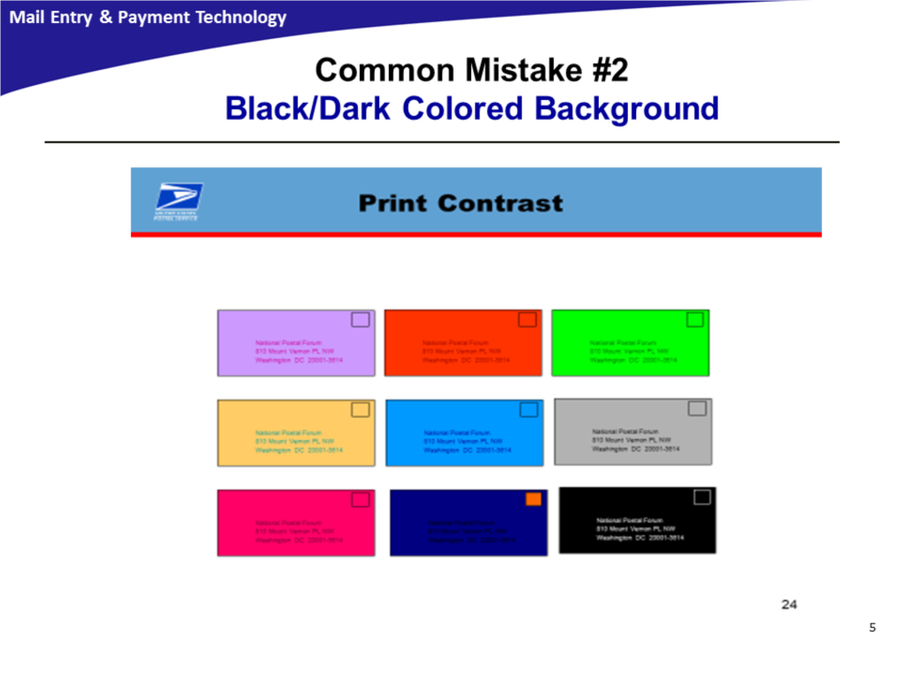
Dark/Black Background Color on Mail Pieces
Mail pieces must meet contrast and reflectance standards as outlined in the Domestic Mail Manual (DMM). Addresses and barcodes cannot be read by the automation equipment if printed on a dark or black background.
Letter mail automation processing can also be impacted by mail pieces with dark colored borders or edges, due to the automated equipment not being able to determine where the mail piece begins and ends for the purpose of establishing the timing and spacing between mail pieces.
It’s understandable that mailers want to use different colors in their customer communications in order to stand out from the crowd. But if these mail pieces do not reach their customers because the USPS equipment cannot read the addresses correctly, even the most attention-grabbing design in the world is a lost cause.
So when designing mail pieces, mailers should take the following into consideration. Black mail pieces do not reflect light and inhibit processing, so while this may be acceptable, it is not recommended for successful processing on the automated equipment. If using colors, light pastel backgrounds are recommended for mail pieces to provide enough contrast between the background and the ink. All inks used to address mail pieces should contain one to two parts black in their makeup. Fluorescent-colored papers may have been popular in the 1980s, if my mother’s collection of my elementary school art projects is any indication, but they are not recommended for mail pieces due to their highly reflective properties.
In his presentation, Rob demonstrated how different colored envelopes can affect the readability of the address in the following image:
Screening and Imaging
Print reflectance difference requirements must be met by both the barcode and the surface on which it is printed, ensuring the barcode can be successfully read and interpreted during processing.
Some important considerations to keep in mind:
The presence of dark fibers on the outside of an envelope or mail piece, as well as the bleed-through of internal security screen or other print, pictures, etc. on mail pieces, can negatively impact processing on the automated equipment.
Bleed-through occurs when the envelope lining or security pattern are too dark, or the paper used to fabricate the envelope is translucent or of insufficient paper weight or thickness (there’s that minimum requirement again!). Bleed-through can also occur if printing on the insert shows through and is visible in the address area.
The maximum print contrast ratio for designs, fibers, or bleed through is 15%. If you’re unsure if your mail piece meets this requirement, this can be tested by a mail piece design analyst using the USPS envelope reflectance meter.
Return Address Placements on Letters and Flats
As mailers, we worry enough about the delivery address; after all, if our mail piece doesn’t make it to the correct recipient, the value of our message is lost. But some mailers may not think about the return address as much — and that is a mistake. Most of you know that the delivery addresses on a letter-size piece should be within the optical character reader (OCR) read area. And, most of us remember from learning to write a letter in elementary school that the return address information should be in the upper left corner, but are you aware that there are specific requirements the return address should meet? First of all, this information should never be in the OCR read area; it should always be above two and 3/4” from the bottom of the mail piece and extend no more than 50% of the length of the envelope.
On a flat-size mail piece, the return address should always be in the upper left corner. Ideally, the delivery address should remain at least one inch below the return address and at least one inch to the right of the return address. Proper placement of the return address will reduce the incidence of return address selection by automation equipment, which can loop the mail piece back to the return address.
Text or Graphics in the Barcode Clear Zone
Many mailers place text or graphics in the barcode clear zone, but this practice is not recommended if the mail piece is not pre-barcoded. This zone is the rectangular area in the lower right corner of the address side of cards and letter-size pieces, extending four and 3/4” from the right edge and 5/8” from the bottom edge, where the automated equipment applies a barcode when a mail piece is not pre-barcoded. A label may be affixed to this area if the customer-applied barcode cannot be read by the automated equipment. In addition, these pieces maybe subjected to additional handling.
Stay tuned for part two of this article, which will appear in our May e-newsletter. And I would like to extend a huge thank-you to Rob Hanks and the Madison-area PCC for allowing me to reference their presentation in this article. It’s also a great reminder that PCC meetings like this are excellent resources for mailers looking for the most comprehensive industry knowledge. We’ve written on this in the past, but it can’t be said enough — if you wish to excel in the industry, organizations like this are a great place to start.
Amanda Armendariz is Editor, Mailing Systems Technology media, with over a decade of experience covering the postal industry. She can be contacted at amanda.c@rbpub.com.