Direct mail has certain advantages over digital channels because it is a physical medium. For example, studies have shown that the human brain processes and remembers marketing messages better when displayed with ink on paper.
To increase the likelihood of success, your marketing message has to resonate with your intended audience. It’s imperative that you use an effective design to lead the recipient through your direct mail package so that the writer’s words have maximum impact and thus lead to a sale and hopefully much more.
Every section or component of the direct mail piece you use for your campaign should be dedicated to at least one part of the classic AIDA (Attention - Interest - Desire - Action) formula. When these all work in harmony, they keep your prospect engaged.
So how do you do that?
Much of what you need to know about direct mail design basics depends on what format you’re using for your campaign.
Postcard design, for example, is maximized for making it as simple as possible for consumers to understand your offer and everything that draws them to it. There’s only a limited amount of real estate to work with using that design, so your copy, graphics, and images have to be deployed carefully on both sides.
On the other hand, envelope design gives you additional flexibility because there’s more room. I’ve already mentioned those all-important marketing touches. An envelope means more opportunities to use papers, inks, finishes, and other tactics, in order to stand out in the customer’s mailbox and avoid being tossed into the recycling bin.
And folded self-mailers? They have unique advantages that in some ways take from the best of both postcards and envelopes.
To increase your chances of success and good ROI, here are some basic direct mail design best practices to consider when planning your campaigns regardless of the format you choose.
1. Create a Visual Hierarchy
Your message (or offer) has to stand out in order to get the customer’s attention — and keep it. Your copy’s font, type size, and even color are just part of how you need to set up a system to organize your ideas.
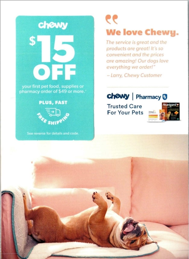
To guide their eye flow — how you want them to read or scan copy and understand visual elements — use headings, subheadings, small blocks of text, and white space.
That last point is really important, especially in a world where word count has been dropping steadily for years. Instead of a crowded busy design, negative space helps you emphasize your message.
In the example above, the eye is drawn first to the big type and color of the response card, then the smaller type testimonial, then downward to the cute dog picture.
2. Personalization Is Powerful
Accurate list data is the single most important factor in the success of your direct mail campaign. With it, you can segment your prospects based on geography, gender, age, behavior and spending, income range, and other factors.
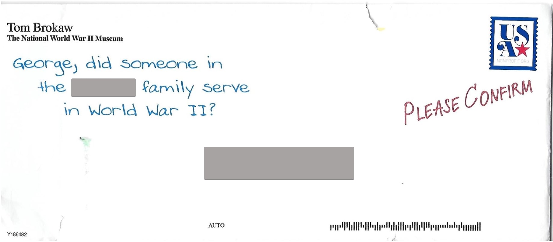
With Variable Data Printing (VDP), take that information you know a step further on your mail pieces. Instead of generic and bland spray-and-pray strategy, the images, offers, and calls-to-action are likely to be much more attention-getting and relevant to them personally when they are customized, as on the front of this outer envelope.
3. Show the Best Possible Images
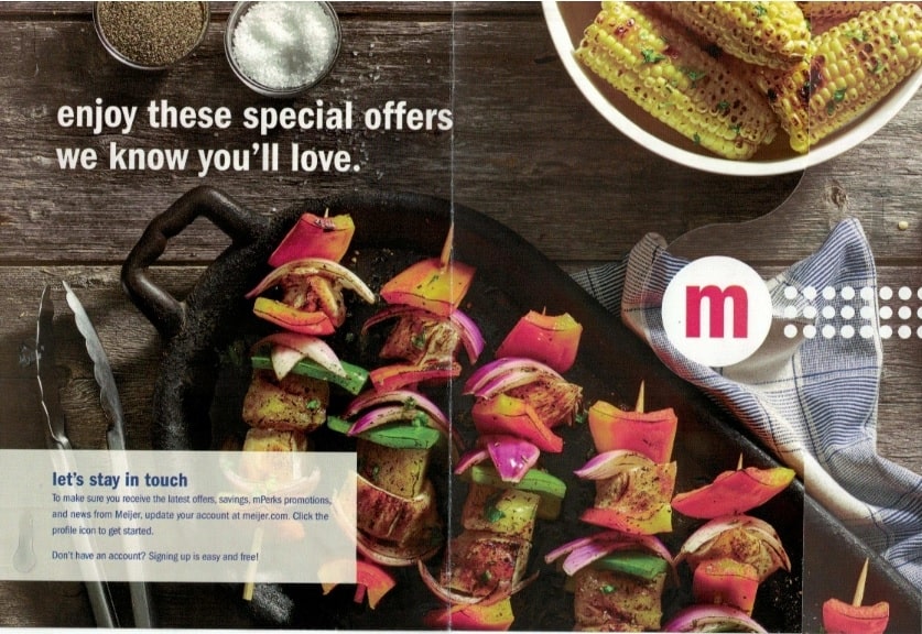
Your pictures should be interesting, perhaps even captivating, to stand out to the prospect. The right artwork — whether it’s a clear, high-resolution photograph or an illustration — should support or boost your message. When printed on high-quality paper stock, it increases your brand’s selling power. In this example, the four-color image of food tantalizes the consumer.
4. Integrate Familiar Digital Icons
As I’ve already noted, people today communicate using fewer words. Thanks to all of the digital devices in our lives, icons, emojis, and other symbols save time when viewed because they are universally understood. Your direct mail should reflect this reality by including social brand logos, Google Maps-type location pins, word bubbles, and other modern touchpoints and symbols for today’s audiences.
5. Use a Strong Call to Action
After using your organizational system to lead your prospect through the reasons to buy your product or service, join their organization, or donate to their cause, there’s just one task left: making it easy for them to take the action you desire.
How? With big type, a bold font, an arrow, or a highlighted box, that makes that final step unmissable.
Whether it’s a phone number, a website, a QR code, or a physical address, your customer should never guess what they need to do next. And personalization, with a PURL, QR code, or customized map, really says that you have their specific interests, and a solution, to offer.
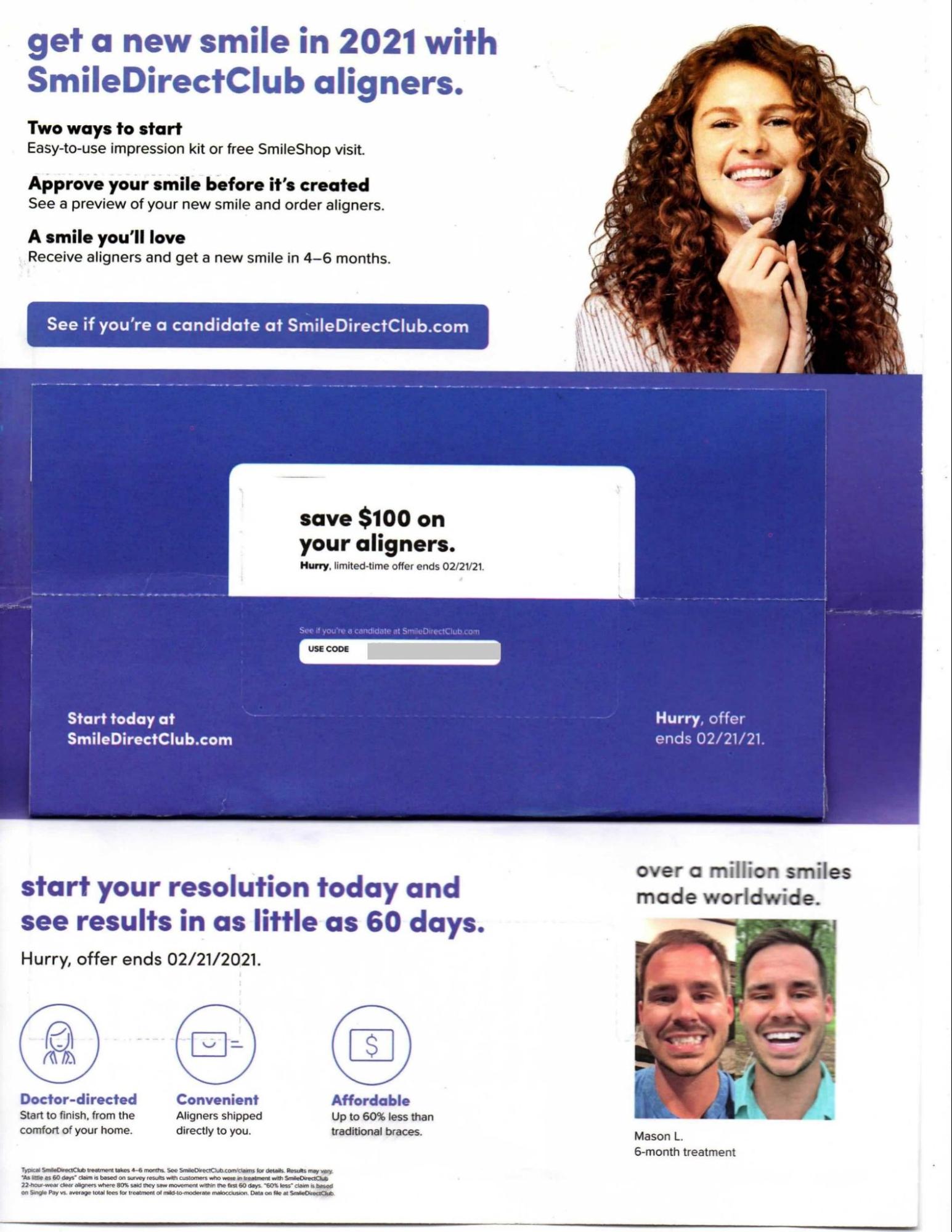
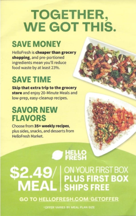
In this example, the headlines and food images point the reader’s eye towards the offer and the website CTA.
Additional Direct Mail Design Tips
Direct marketing design should always work to keep the prospect involved and off-balance, forcing the eye to shift and move around the offer or message until finally, the package is so compelling that action will be taken — right now.
Here are some additional ideas for helping your direct mail design:
Because tens of millions of Americans subscribe to daily Informed Delivery notifications, they see your direct mail piece before it arrives in their home. Make sure the address side headlines and CTA is readable in case they decide to take action early.
Handwritten messages get noticed. When used in moderation, they highlight important parts of your sales offer.
Postal size, weight, and thickness requirements exist for a reason — to allow for the efficient processing of mail. While an interesting or unique mail design may stand out to a customer, if it isn’t machinable, the additional costs involved may not be worthwhile.
Regardless of what format you settle on, you can achieve excellent design. Your campaign’s goals and budget will guide many of your creative processes while also saving you time and money, and creating great response and ROI.
Jill Corcoran has been building teams to serve marketers for the past 20 years. Employee and client happiness have always been her “North Star.” She runs the world's most complete resource of direct mail campaigns — Who’s Mailing What! Visit https://www.whosmailingwhat.com/ or email jcorcoran@whosmailingwhat.com for more information.
This article originally appeared in the September/October, 2023 issue of Mailing Systems Technology.


