Your choices of fonts, envelopes, and color used in your direct mail campaigns can not only impact your customer response rate and overall delivery of your mail piece, but they can also cause postage costs to increase — which is never something a mailer wants to see. It’s vital to avoid mistakes in order to have a successful direct mail campaign and keep postage costs at a minimum; however, it can sometimes be daunting to stay updated on all the mail piece best practices. So, let’s explore some of the most common mistakes that can have a big impact on your campaign if not rectified.
Fonts
The USPS prefers that a sans-serif font be used when addressing mail pieces. The font size needs to be eight-point or higher, and all capital letters is preferred. The difference between serif fonts and sans-serif fonts is that sans-serif fonts do not contain the little feet on the bottom on the letters. This helps USPS equipment better read the address block of the mail piece.
Sans-serif fonts are broken up into four families: Grotesque, Neo-Grotesque, Humanist, and Geometric. Grotesque fonts are the oldest of the sans-serif fonts and included New Gothic and Franklin Gothic. The Neo-Grotesque family is more modern and includes Helvetica and Arial, which the USPS prefers. Humanist includes Gill Sans and is even more modern than the previous two families. Finally, Geometric is (not surprisingly) based on geometric shapes. Futura is an excellent example of a Geometric font.
The important thing to remember with fonts is choosing a font that will work with your audience. If your offer is going to an older audience, you will want use a font that is clean and easy to read; Arial is an excellent choice here. On the other hand, if you are mailing to millennials, you may want to use a humanist font such as Gill Sans; the more modern look piques the interest of a younger generation and can increase your response rate.
Envelopes
Envelopes and self-mailers can have a huge impact, both positive and negative, on a direct mail campaign. Choosing the wrong size, color, or paper stock can add additional postage or even disallow your mailing altogether. On the flip side, a well-designed mailer using the right color, size, and paper can increase your open rate while also providing you with additional areas for messaging or a call to action.
When picking out an envelope size or designing a self-mailer, you will need to determine if you are mailing at letter rates or flat rates of postage. If you are planning on mailing out your piece at letter rates, the maximum size the envelope or oversized card can be is 6.125” x 11.5”. The maximum size of a folded self-mailer or booklet is a little smaller, at 6” x 10.5”. If your mail piece is larger, you will be mailing out at the flat rate of postage, and the placement of the address block differs from a letter-size mail piece. The difference in postage for a Marketing Mail Letter vs. a Marketing Mail Flat can be as high as 30.1 cents per piece, based on the mixed automated area distribution center (AADC) rate.
The most common sizes used for direct mail are a #10 envelope, a 6”x9” envelope, and a 9”x12” envelope. The #10 and 6”x9” envelopes both mail out at a letter rate provided you meet all the other mailing criteria. The 9”x12” envelope mails out at a flat rate of postage. Since these are standard sizes of envelopes, they are easy to obtain and cost-effective to purchase. The downside is without using color or a catchy teaser line, they get lost in the pile of mail many of us receive on a daily basis. By choosing an envelope that is a little different in size, you can help your mail piece stick out, which can increase your response rates. Try using a #12 envelope, which is 4.75”x11” or an A-10 envelope at 6”x9.5” to give you an advantage and still mail at the letter rate of postage.
Color
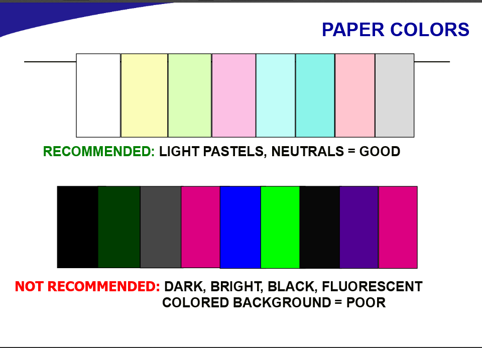
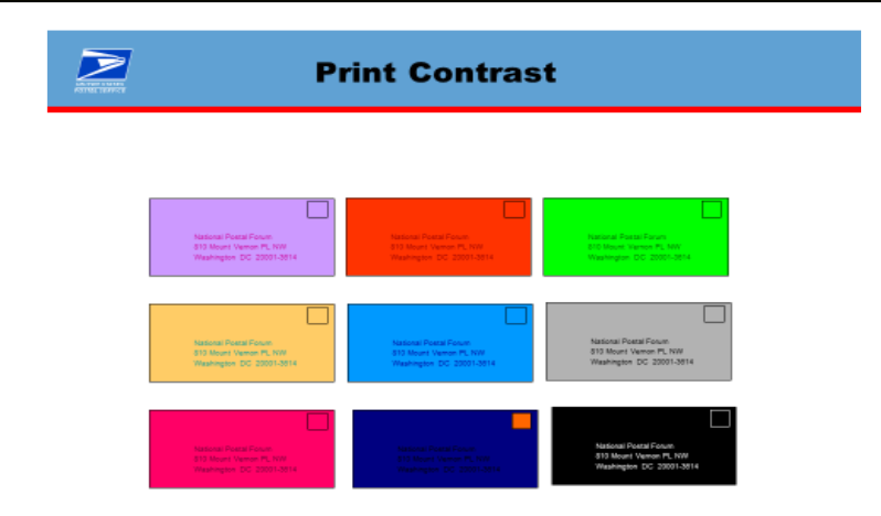
The background color of your envelope should be white, neutral, or a light pastel color. This allows USPS equipment to read the barcode and address block on your mail piece. Dark, bright, black, and fluorescent colors impede the ability of USPS equipment to read barcodes, which can result in mis-reads and postage surcharges. If you decide to print an envelope or self-mailer in full color, you can knock out an area to address the mail piece. Most designers use the size of a standard window from an envelope to determine the size of the knockout. The size of a standard #10 window is 1.125” x4.5”. I recommend going with at least 1.5” in height to ensure you have enough room for addressing and still keep .125” clearance to the left and right and .028” clearance top and bottom.
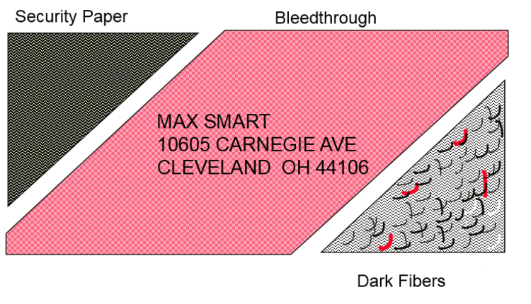
Envelopes made with paper stock that contains dark fibers, a bleed through from inserts inside the envelope, or security envelopes printed on lightweight paper can affect the readability of the address block and barcode, resulting in additional postage.
Other impacts to your response rate could involve using a window envelope versus a standard envelope. A window envelope gives the impression of a bill, statement, or direct mailing. A standard envelope can provide a mail piece with a personal feel by the font used for addressing and how you are applying postage. You will have to decide if metering the mail, using a permit, or using a precanceled stamp is best for you. They all have advantages and disadvantages for applying postage.
The pros of metering your mail are that no return address is needed on your mail piece, and you can use this process for non-identical weight pieces. The cons are that meter machines need to be purchased or leased, you have an opportunity for spoilage (lost postage), and, if mailing First-Class, you must have the correct date on each mail piece.
When using a postal permit, the advantages are the permit can be printed directly onto the mailer, there is no need to purchase stamps or lease a meter machine, and less labor is involved. The cons are the mail piece looks like a direct mail piece; unless authorized by the USPS, each piece must be identical in weight; and, if using a company permit, a return address must be included.
Precanceled stamps make mail pieces look like First Class Mail and are more visually appealing versus red meter marks or permits. The down side is that stamps need to be purchased, they need to be applied, spoilage might be incurred, and the mail piece will need a return address.
Teaser copy on an envelope or self-mailer can increase open rates and, thus, response rates. A teaser line should highlight the offer, have a call to action, or have a tag line about your business. A teaser line should be big, bold, and grab the reader’s attention. People will decide within seconds of picking up your mail piece if they will open it or discard it.
By making the right choices in regards to fonts, type and size of the mail piece, color, and how you are applying postage can help increase your response rates while still keeping postage costs to a minimum.
Examples:
Rob Hanks is a customer service representative at Suttle-Straus and has more than 24 years in direct mail. Rob is a Certified Mailpiece Design Professional and a Mail Design Professional with the United States Postal Service. Rob also serves as the Industry Co-Chairperson for the Greater Madison Area Postal Customer Council. Rob enjoys the challenges of mailpiece design within postal regulations and helping clients save on postage costs.
This article originally appeared in the January/February, 2019 issue of Mailing Systems Technology.


